Tour 2000
Redesigned an existing travel portal for clearer proposals, journeys, and sign-up flows
I turned a well-defined client vision into a more usable product, improving structure, flows, and interface quality without losing the travel inspiration layer.
Challenge
Align business goals, stakeholder vision, and traveler usability within a single portal, designed to feel more cinematic and compelling. An experience users actually want to navigate, not just use.
Services
UX/UI Product DesignFront-end DevelopmentCreative Direction

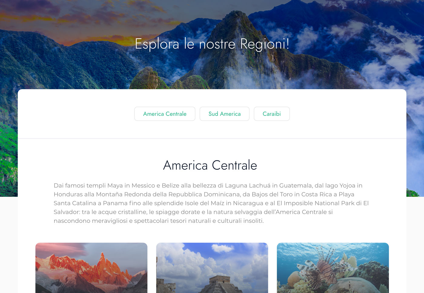
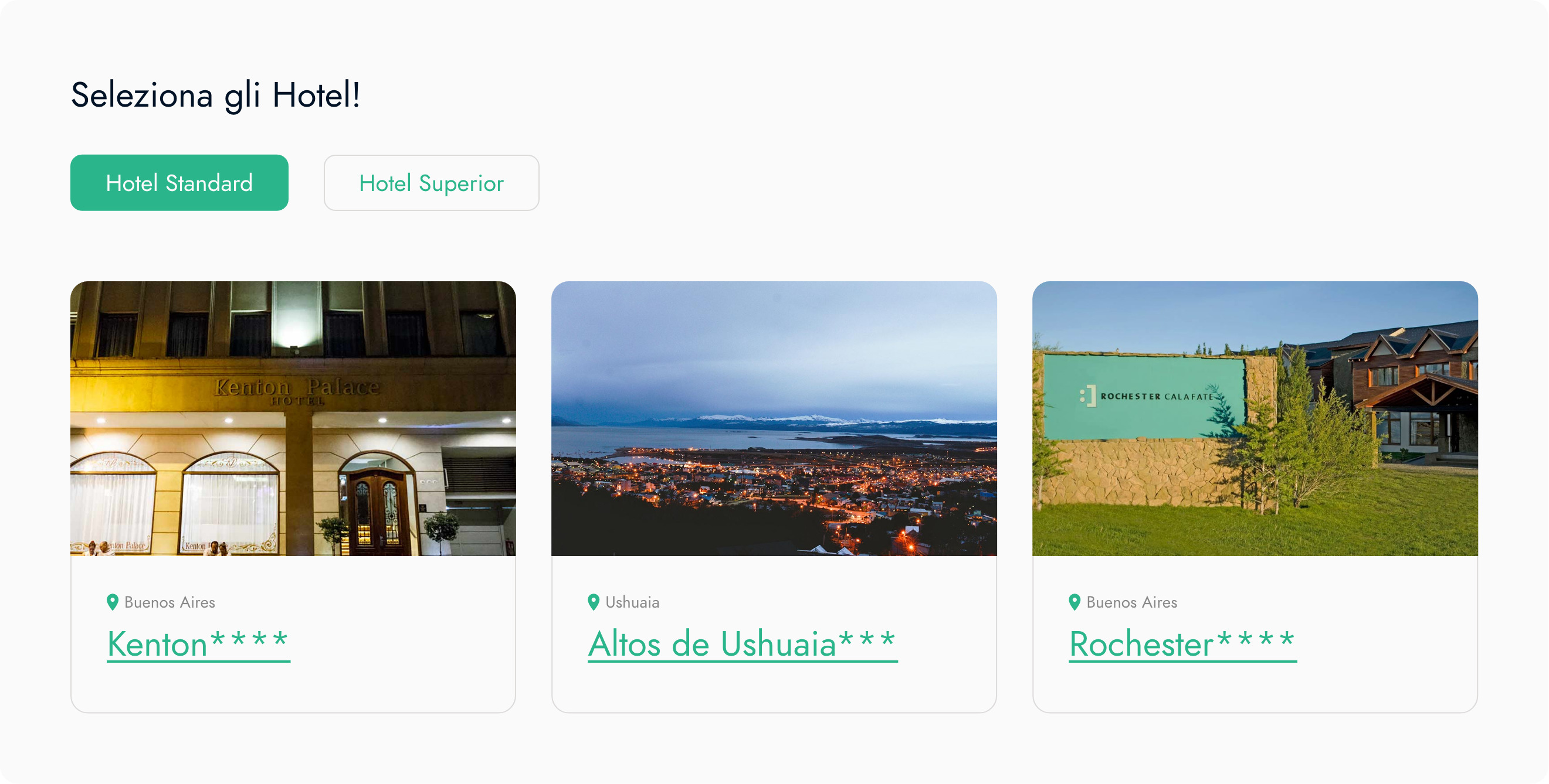
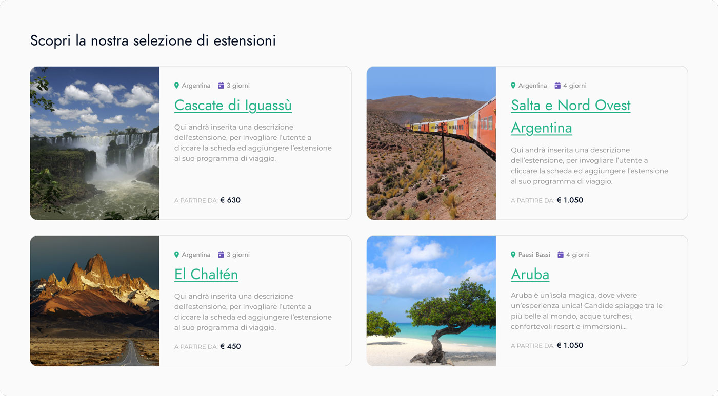
Reworking an existing travel portal into a clearer product for travelers and stakeholders
Product overview
Tour 2000 was not a greenfield project. The client already had an existing product and a clear idea of what the new portal needed to do.
The platform serves people exploring travel proposals, comparing journeys, and starting the sign-up or enquiry path with enough confidence to continue.
Context / challenge
The first step was to study the full documentation provided by the client, then identify where the product structure and technical approach needed to improve.
The challenge was to respect a strong initial direction while making the portal more functional, more usable, and more engaging for the end traveler.
Role
I worked across the product from early analysis to final frontend delivery, helping turn a defined brief into a clearer and more workable experience.
- -Reviewed the existing product and the full client documentation
- -Proposed improvements to documentation and product architecture
- -Ran competitive analysis to identify patterns worth adapting
- -Designed user flows, user journeys, and mockups
- -Translated the approved direction into frontend code
Approach
The work moved in sequence: understand the material, reduce ambiguity, choose the right interaction patterns, then shape the experience screen by screen.
Every decision had to stay realistic for the client's priorities, delivery constraints, and available budget.
Key outcome
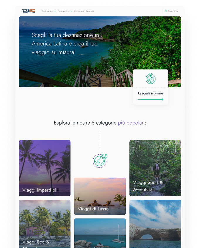
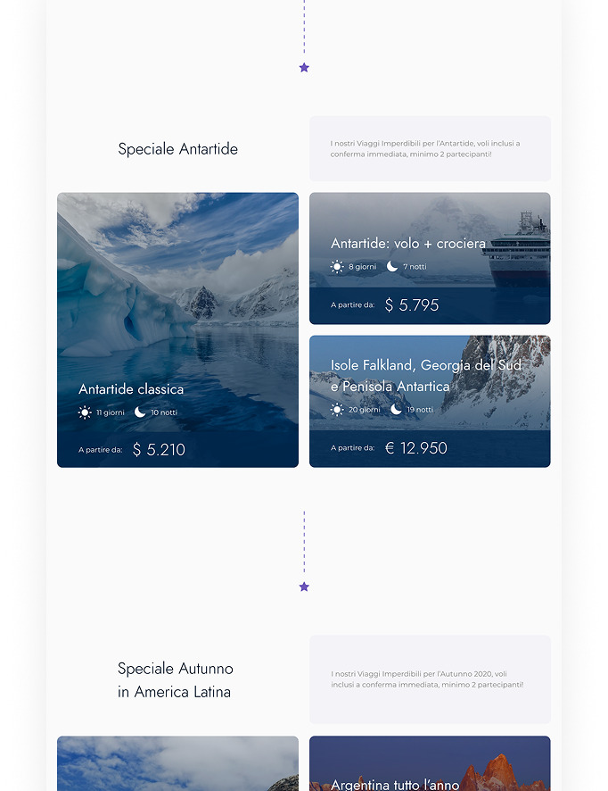
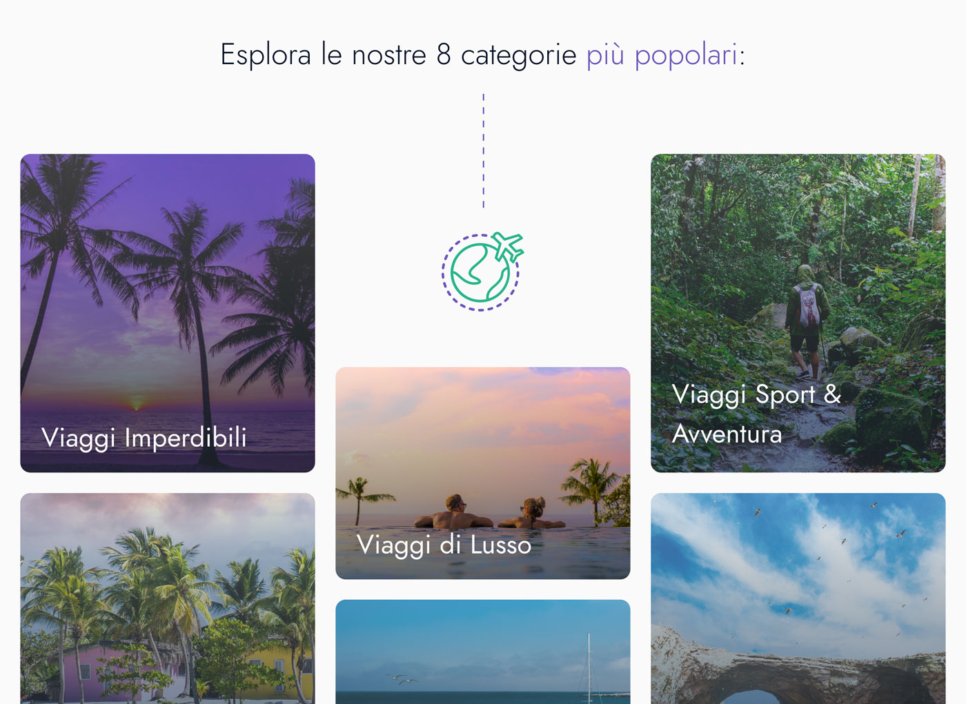
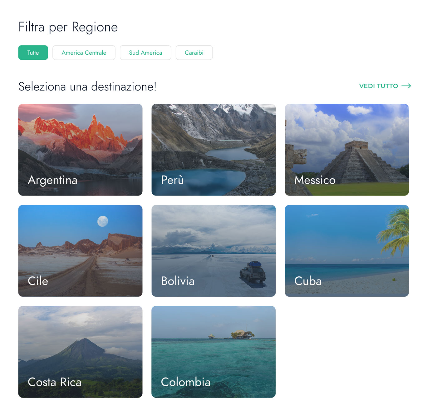
The strongest outcome is a portal that feels more structured and more cinematic, using imagery to make the journey feel tangible while keeping decisions clearer.
- -Travel proposals are easier to scan and compare
- -Journeys and next steps feel more understandable
- -The experience stays aligned with stakeholder expectations
- -The imagery makes the destination feel more real without turning the experience into a generic booking flow
Result
The result is a more solid travel portal: clearer for users, closer to the client's vision, and better structured to support exploration, sign-up, and journey planning.

Working on similar challenges?
I design digital products that bring clarity to complex services, from concept to release.
Enter to runCmd+K focus