ITA Chameleons
Redesigning a cabin-crew app for speed, clarity, and real flight pressure
I led the redesign of an existing crew tool, restructuring the product from the ground up while preserving the usage patterns cabin crews already knew.
Challenge
The challenge was to improve complex in-flight flows without breaking learned usability. Here, simplicity and speed mattered more than making the interface look flashy.
Services
UX/UI Product DesignFront-end DevelopmentCreative Direction
A new daily crew tool: same operational logic, rebuilt for speed and clarity
Product overview
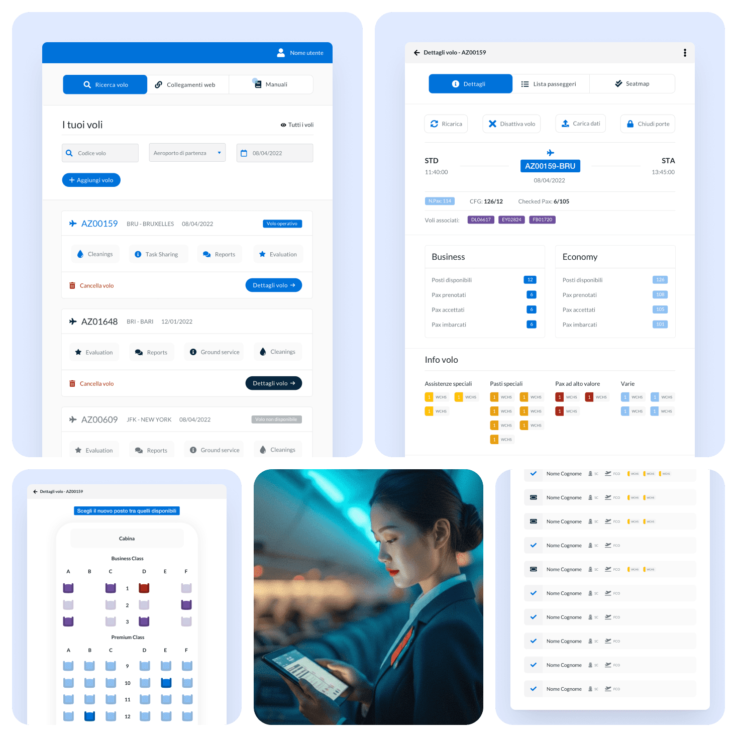
Chameleons is a mobile-first operational app used by cabin crews during real flights. It brings flight context, passenger handling, seat-map actions, task sharing, manuals, and evaluation flows into one working system.
This was not a net-new product. It was a redesign and rebuild of an existing application that had reached its limits.
Context / challenge
The old app contained important operational logic, but the product structure was no longer enough for the pace and complexity of daily onboard work.
The challenge was to rebuild the experience from zero while studying the old app carefully, so crews could move faster without losing the usability patterns they had already learned.
- -Keep the product reliable under real flight pressure, where crews manage many people, requests, and interruptions at once
- -Make key flows cleaner and more fluid without forcing crews to relearn the whole system
- -Prioritize simplicity and speed over visual flashiness
Role
I led the product design direction across the rebuild, defining how the new structure could improve daily operations without breaking continuity with the old tool.
- -Restructured the product architecture from the ground up
- -Redesigned the dashboard, passenger workflows, seat handling, task sharing, manuals, and evaluation flows
- -Kept the interaction model close to real crew behavior and time-critical onboard decisions
Approach
The work started with careful analysis of the existing product: what crews already understood, where friction appeared, and which patterns still needed to stay familiar.
From there, I redesigned the experience around fast scanning, short paths to action, and a clearer operational hierarchy across screens.
Key outcome
The product keeps the same operational goals, but in a structure that is easier to read, faster to use, and more consistent across tasks.
- -Flight overview gives crews immediate situational awareness
- -Passenger handling supports faster triage and follow-through
- -Seat-map actions stay close to the decisions crews need to make in the moment
- -Task sharing, manuals, and evaluations remain accessible without fragmenting the experience
System thinking
The rebuild was not only about improving single screens. It was about creating one operational language across the whole product.
That meant balancing two needs at once: introducing a cleaner system and preserving the familiarity that makes a tool usable in live service conditions.
Result
The result is a crew tool designed for real flights: simple, fast, and reliable under pressure. It improves how crews scan, act, confirm, and coordinate, without chasing a flashy interface that would slow them down.

Working on similar challenges?
I design digital products that bring clarity to complex services, from concept to release.
Enter to runCmd+K focus